

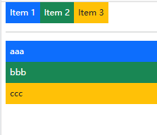
一主轴方向、默认横线排布 flex-row(默认)。flex-column是竖向排列
<div class="d-flex "> <div class="p-2 bg-primary text-white">Item 1</div><div class="p-2 bg-success text-white">Item 2</div><div class="p-2 bg-warning text-dark">Item 3</div>
</div><hr>
<div class="d-flex flex-column "><div class="p-2 bg-primary text-white">aaa</div><div class="p-2 bg-success text-white">bbb</div><div class="p-2 bg-warning text-dark">ccc</div>
</div>
二、主轴对齐 (justify-content-*)
.justify-content-start: 项目靠主轴起点对齐 (默认)。
.justify-content-end: 项目靠主轴终点对齐。
.justify-content-center: 项目在主轴上居中对齐。
.justify-content-between: 第一个项目在起点,最后一个在终点,中间项目间距相等。
.justify-content-evenly: 项目间和项目与边缘的间距都相等。
<div class="d-flex justify-content-evenly "> <div class="p-2 bg-primary text-white">Item 1</div><div class="p-2 bg-success text-white">Item 2</div><div class="p-2 bg-warning text-dark">Item 3</div>
</div><hr>
<div class="d-flex justify-content-end "> <div class="p-2 bg-primary text-white">Item 1</div><div class="p-2 bg-success text-white">Item 2</div><div class="p-2 bg-warning text-dark">Item 3</div>
</div>
